| Here is a method to create cubic style text in Corel Photo-Paint. This tutorial was wriiten using Photo-Paint version 10 but the simple method can be undertaken using almost any version. | ||
| STEPS: | ||
1.
Create a new image.
|
||
| 2.
Create some white text using a thick bold font. Here I have use Arial Black at 24 points. Align the text to the centre of the image (Object > Arrange > Align and Distribute, To Center of Document. (Fig 1) |
 Fig 1. |
|
3.
Combine the text with the background.
|
||
| 4.
Apply a Gaussian Blur. (Effects > Blur > Gaussian Blur ) at a radius of 4 pixels. (Fig 2) |
 Fig 2. |
|
5.
Duplicate the background.
|
||
6.
Apply a Pixelation distortion.
|
 Fig 3. |
|
| 7.
Reduce the opacity of the object to 50% using the slider on the Object Docker and then combine this object with the background. (Fig 4) |
 Fig 4. |
|
| 8.
Apply a sharpen effect. From the menu choose Effects > Sharpen > Sharpen. Click the Reset button and then press OK. Repeat the sharpening effect once again (Effects > Repeat > Last Effect, or CTRL+F). (Fig 5). |
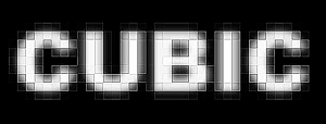 Fig 5. |
|
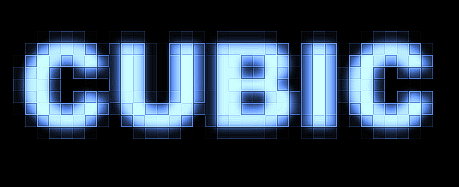
| 9.
Add some colour. From the menu choose Image > Adjust > Color Hue. In the Color Hue dialogue box, click the Reset button, then uncheck the Shadows checkbox and slide the Step slider to 50. For a blue appearance, click More Cyan once and More Blue twice (Fig 6a) For a red appearance, click More Red twice (Fig 6b) For a Green appearance, click More Green once, More Cyan once, and More Yellow once. (Fig 6c). |
||
|
||
VARIATIONS:
- Play around with the Color Hue settings for more colours.
- Try changing the settings in the Pixelation dialogue box for different effects.
- Increasing the Edge Level in the Shapening dialogue box to 50% or repeating the original sharpen step more times increases the contrast in the pixel boxes, creating a more pronounced effect.
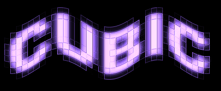
- Add a Ripple Effect at a low periodicity (Effects > Distort > Ripple) (Fig 7).
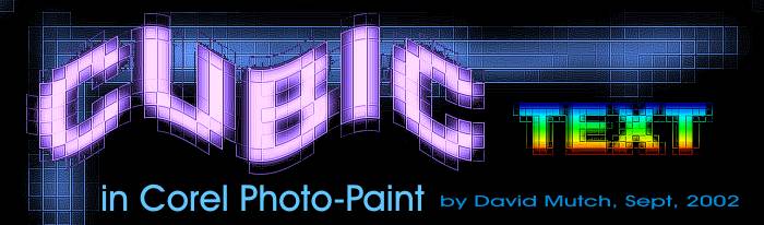
Fig 7.- Create a rectangle object a little bigger than the pixelated text and fill it with a fountain fill. Change the merge mode on this rectangle object to Colour. (Fig 8)
Fig 8.
| T e
x t E f f e c t s # 3 M
e n u : <- PREVIOUS || NEXT ->
|
||||||||||||
|
||||||||||||